
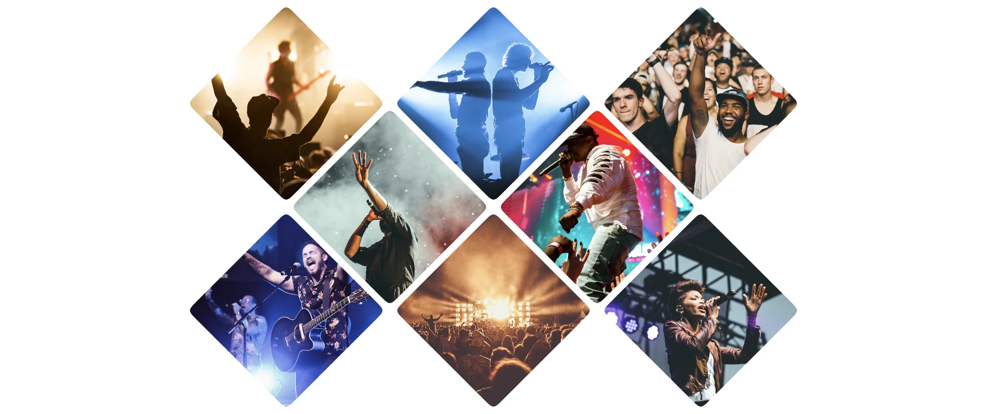
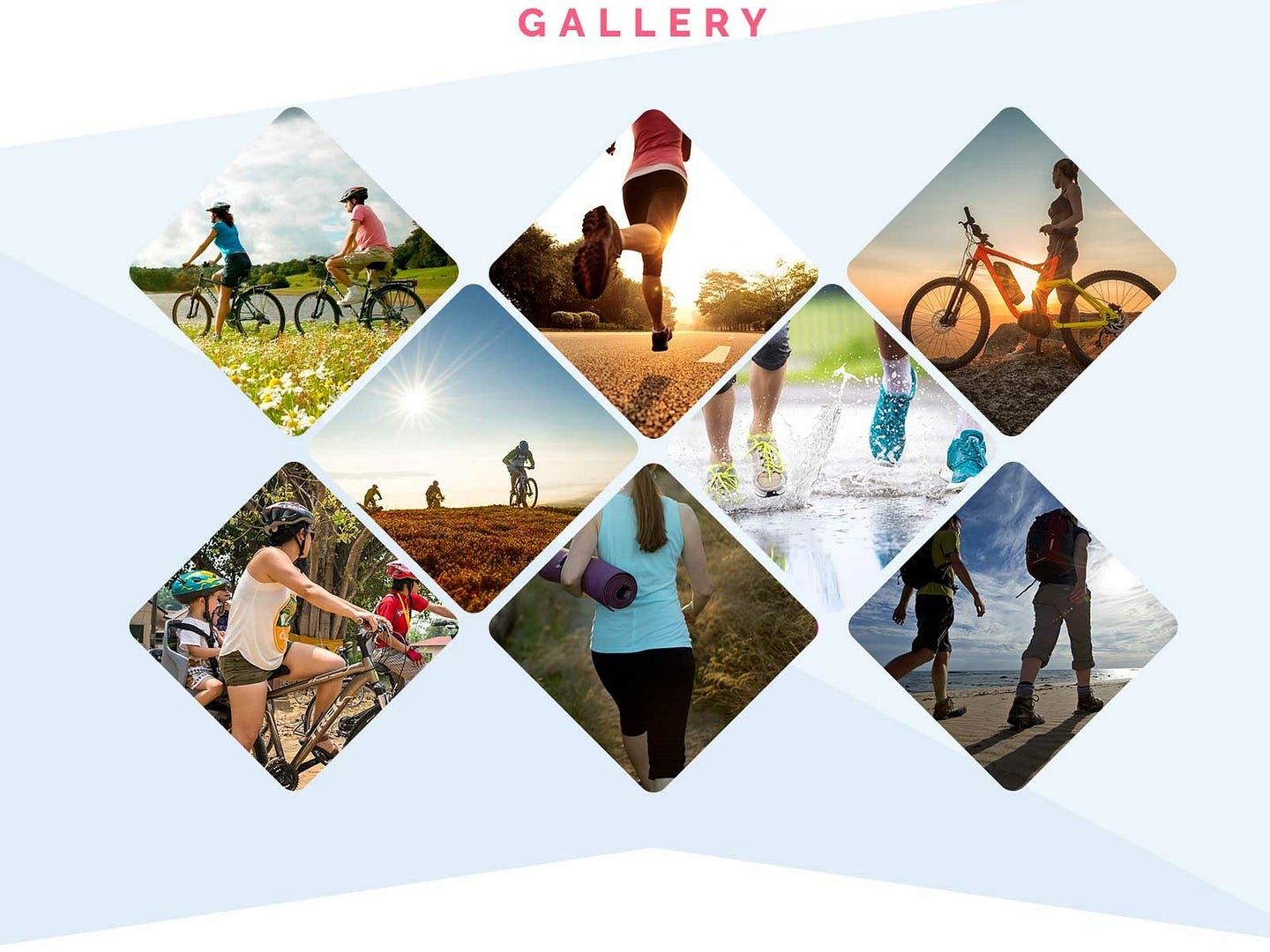
The other day, while navigating online looking for inspiration, I found a photo gallery design by kevin on Dribbble, so I decided to create a minimal version of it (you can see a live demo on CodePen or at the end of the article.)
The HTML Structure
The HTML will be limited to just a container and eight photos for simplicity. This choice is just for the demo. The idea is for the code to be extendable to any number of pictures or elements —e.g., buttons or links containing the images or having them as backgrounds.
<article class="grid-gallery">
  <img src="./pic-1.webp" alt="description of picture 1" />
  <img src="./pic-2.webp" alt="description of picture 2" />
  <img src="./pic-3.webp" alt="description of picture 3" />
  <img src="./pic-4.webp" alt="description of picture 4" />
  <img src="./pic-5.webp" alt="description of picture 5" />
  <img src="./pic-6.webp" alt="description of picture 6" />
  <img src="./pic-7.webp" alt="description of picture 7" />
  <img src="./pic-8.webp" alt="description of picture 8" />
</article>
Instead of using <img> tags, we could use buttons or links, and the CSS change would require only minor modifications. Again, for simplicity, we'll go with only images.
Setting the Stage: Styling the Grid
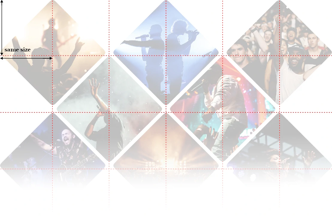
To create the effect of the intertwined pictures, we will use a grid with six columns. This may seem counterintuitive because we have rows with 3 or 2 photos. But it makes sense that each image will occupy two columns, and the rows with only two pictures will be "shifted" by one column (more on this soon). Also, the rows will be half the size of the image, making the grid cells squared.
While we know the number of columns, the number of rows will depend on the number of photos in the gallery... and we don't know it. Therefore, instead of specifying a template, we will define their default size and let the browser deal with them as they are added.
This is the CSS code for the container:
.grid-gallery {
  --size: 100px;
  display: grid;
  grid-template-columns: repeat(6, var(--size));
  grid-auto-rows: var(--size);
  gap: 5px;
  place-items: start center;
  margin-bottom: var(--size);
}
Let's see what each of those properties do:
-
--size: 100px;Specifies what will be the size of the cell in the grid. -
display: grid;This indicates that we will be using a grid. -
grid-template-columns: repeat(6, var(--size));Defines the number and size of the columns: 6 columns of 100px each. -
grid-auto-rows: var(--size);Each column added to the grid will have the defined cell height. -
gap: 5px;It is the distance between the cells and, therefore, the photos. -
place-items: start center;Specifies how the images will be aligned within the cell: vertically, to the top, and horizontally, in the center. -
margin-bottom: var(--size);This code fixes an issue with the gallery: the photos occupy the size of two cells, so the last row of images will overflow the cell and potentially overlap the content below. To avoid it, we add a bottom margin equal to the size of an extra row.
With this, we have set the stage for the gallery. The rest of the styles will be primarily focused on the images.
Picture This: Styling the Images
The images will be squared by default to fit into two grid cells. Then, we will crop them to look like a rhombus (or rotated but without being turned).
.grid-gallery img {
  width: calc(var(--size) * 2);
  height: calc(var(--size) * 2);
  object-fit: cover;
  grid-column: auto / span 2;
  border-radius: 5px;
  clip-path: path("M90,10 C100,0 100,0 110,10 190,90 190,90 190,90 200,100 200,100 190,110 190,110 110,190 110,190 100,200 100,200 90,190 90,190 10,110 10,110 0,100 0,100 10,90Z");
}
Notice that we are applying the styles to the image directly because that is how I initially structured the code for simplicity. If you go with a different HTML structure, like links with the pictures inside, you must adjust the code a little (but only a little).
Let's review the code one property at a time to check what it does:
-
width: calc(var(--size) * 2);Specifies the picture's width, which will be twice the size of a grid cell. -
height: calc(var(--size) * 2);Sets the picture's height; it's the same value as the width, so we could have used something like aspect-ratio:1 instead. -
object-fit: cover;We most likely changed the image's aspect ratio by setting a squared size. We indicate that we want the image to occupy the whole space to avoid stretching or gaps. -
grid-column: auto / span 2;With this, we are indicating that the picture should go in the text available cell (auto) and occupy two cells' width (span 2). -
border-radius: 5px;This is a decorative option: the photos will have small rounded corners as they look cleaner like that... but that's my non-designer opinion. -
clip-path: path("...")We specify a path to crop the image in the rhombus shape with rounded corners. This approach has some shortfalls that we will review in a few paragraphs.
As you may have noticed, we don't specify in which cell each picture has to go. We add pictures and let the browser do its magic, positioning them correctly. There's no need to add complex formulas or verbose code for things that the browser will do automatically for you. Take advantage of those things!
About the clip-path: I used the path() method to create a rhombus shape and give it some rounded corners. But this approach has issues: it is only supported by some browsers, it is messy (too many points and curves, which will be a pain when we add transitions), and it is not responsive —why, in this day and age of the Internet, someone would release a non-responsive CSS feature beats me, but here we are.
Instead, we could use the polygon() method to simplify the parameters (to only 4 points) and add responsiveness and support to all browsers... but we would lose the rhombus rounded corners. Temani Afif shows a way to have rounded corners using the polygon() function, but that solution is not responsive.
The path() method will remain in this demo. But be aware that there are options that will make your code more well-supported.
Avoid overlapping
If you have tried the code we have so far, you will have noticed that pictures need to be arranged appropriately. Instead of rows of three and two photos interlaced, they are all rows of three elements.
Checking the gallery, the images are shifted in one column starting from the fourth and then every five: 4, 9, 14, 19, 24... That progression consists of multiples of five minus one.
Indicating that all the 5x-1 children will be shifted in one column (e.g., start in the second column instead of the first one) is relatively simple in CSS:
.grid-gallery img:nth-child(5n - 1) {
  grid-column: 2 / span 2
}
As mentioned before, the browser will automatically place the new items in the next available cell to fit the element, so all we have to do is indicate this shift and the browser will do all the arranging work for us!
With that, we have the photo gallery with all the images in the right place, but what happens if we add more than eight pictures?
Adding more pictures
As mentioned above, the gallery is extendable: you can add/remove as many images as you want, and they will continuously adapt to this 3—2 grid pattern. Ideally, you will go with a multiple of five (5n, which would end the gallery in a row of two photos) or a multiple of five plus three (5n+3, which would end the gallery in a row of three images).

A 5n+3 photo number provides a more balanced distribution than a multiple of five... but that's my opinion. You can have as many pictures as you like.
Ready, Set, Action: Adding Interactions
So far, we only have a nice-looking image gallery, but it is static. We can do more to make it interactive, starting with what happens when the user places the mouse over the image.
Let's start by dimming the non-active pictures using the :has() pseudo-class. We want to select all the images that are not hovered when there's a hovered image in the gallery.
.grid-gallery:has(img:hover) img:not(:hover) {
  filter: brightness(0.5) contrast(0.5);
}
Don't be scared of that selector; it is more straightforward than it seems. We read it from right to left: select all the non-hovered images from the .grid-gallery that has at least a hovered picture.
The following effect we will add is simple but elegant and pleasant: we expand the image (a little) and dim the non-hovered photos so that the person can focus on the "active" picture.
.grid-gallery img {
  /* ... */
  transition: clip-path 0.25s, filter 0.75s;
}

.grid-gallery img:hover {
  clip-path: path("M0,0 C0,0 200,0 200,0 200,0 200,100 200,100 200,100 200,200 200,200 200,200 100,200 100,200 100,200 100,200 0,200 0,200 0,100 0,100 0,100 0,100 0,100Z");
  transition: clip-path 0.25s, filter 0.25s;
  z-index: 1;
}
On hover, we change the clip-path points, so they move from the rhombus points to the corners of a square (displaying the whole image as defined). It is a slight pain and something that could be considerably simplified by using polygon() instead of path().
We add a z-index to the hovered image so it will overlap all the sibling elements. The active photo may be behind later siblings if we don't include this code.
Finally, notice how we apply different transition times to the hovered image and the rest of the images. This is not only allowed but (almost) recommended to provide a more natural feeling: it feels robotic when everything happens simultaneously and at the same speed.
Focus and Outlines
If you opt for having other elements (e.g., links with the pictures inside) instead of using photos, you should also define the :focus interactions. They can be similar to the :hover one, but don't forget to modify the position of the outline!
Because we are using clip-path to shape the photo, the default browser's outline will likely fall outside the cropped area and be invisible, which is an accessibility violation.
To fix this issue, we can add a negative outline-offset value. That way, the outline will be within the cropped area and visible to the users. For example:
.grid-gallery a:focus {
  outline: 1px dashed black;
  outline-offset: -5px;
}
We could add a pop-up showing a larger version of the image on click... but that falls outside this article's scope.
Conclusion
In this article, we've seen how to create an image gallery, and at the same time, we practiced with many CSS features:
- Templating and aligning items with Grid
- Custom properties (aka CSS variables)
- Clipping with
path()andpolygon() - Transitions on user interaction
- Aspect-ratios
- Filters
- Sibling selection with
:has() - The
object-fitproperty - User-triggered events like
:hoveror:focus
We also discussed alternatives and ways to achieve a similar result with broader browser support. I hope you enjoyed reading the article. To conclude, I'll leave here a demo of the photo gallery in action: