
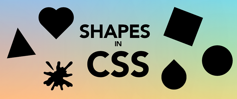
I recently published a short video with 16 figures coded with CSS. I'm adding this article to complement the video, describing how things are done (not just putting something out there) and making it easy for people to copy the code if they want to.
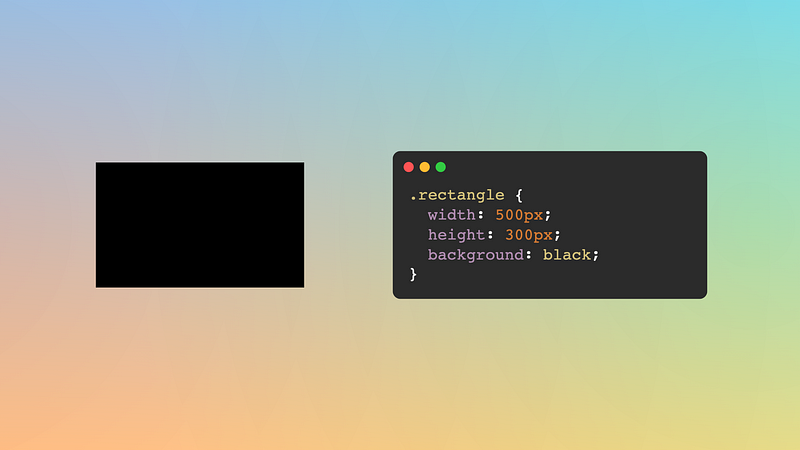
Rectangle
Initially, everything is a rectangle in HTML. So, a rectangle is simple to draw; specify a width and a height. If that doesn't work, you may use an element with an inline display, switch to a block or inline-block element, and you should be fine.
.rectangle {
  width: 500px;
  height: 300px;
  background: black;
}
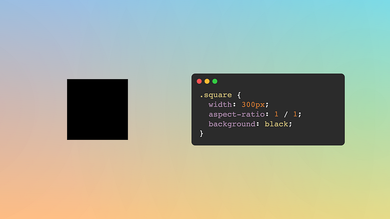
Square
A square is a rectangle where the width and the height have the same value. We could take the rectangle code and change the height to have the same value as the width like this:
.square {
  width: 300px;
  height: 300px;
  background: black;
}
And that would work, but... If we want to change the size of our square, we'll need to update two values each time. It's not a big problem, but in CSS, we have the aspect-ratio property that allows us to specify the relation between width and height. Setting a value of 1 or (1 / 1 like in the video) will also result in a square with the same lines of code, but now we only need to update one line of code to resize it:
.square {
  width: 300px;
  aspect-ratio: 1;
  background: black;
}
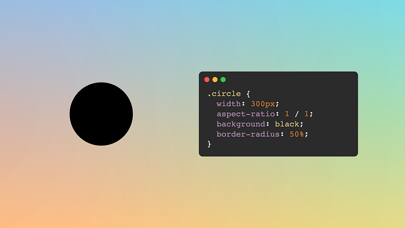
Circle
Starting from a square, we need to set a rounded shape. We achieve that by using border-radius and assigning it to a considerable percentage value (50% or higher will do). Easy peasy.
.circle {
  width: 300px;
  aspect-ratio: 1;
  background: black;
  border-radius: 50%;
}
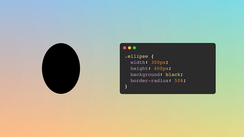
Ellipse
An ellipse is a rounded shape like a circle, but instead of a square, it's based on a rectangle. (There's a more accurate and technical definition of an ellipse, but I'll settle for this one for now.) So we'll add the border-radius property like in the circle, but to a rectangle instead of a square.
.ellipse {
  width: 300px;
  height: 400px;
  background: black;
  border-radius: 50%;
}
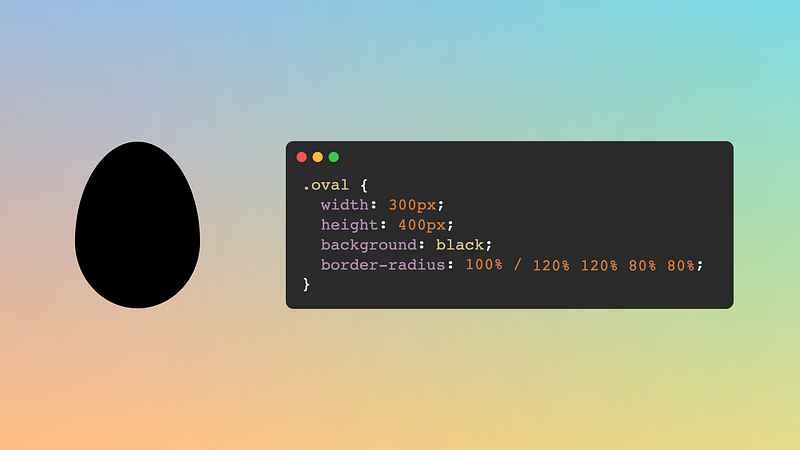
Oval/Ovoid
An oval and an ellipse are not the same. There are some technical definitions of interior circles crossing each other or not, but for simplicity, we'll consider that an oval resembles an egg. We achieve this shape by using both values of the border-radius property. Yes, there are two sets of up to 4 values each: horizontal radii then vertical radii separated by a forward slash (/).
We'll set the horizontal radii to 100%, then specify larger vertical radii values for the top corners and smaller values for the bottom corners. Something like this:
.oval {
  width: 300px;
  height: 400px;
  background: black;
  border-radius: 100% / 120% 120% 75% 75%;
}
The values will depend on the size of the rectangle. Too large values may end up with a flat top, and too small values may end with a flat bottom. You may need to play with the numbers to get your desired shape.
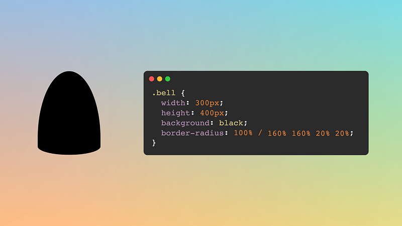
Bell
A bell is an exaggerated ovoid, where one side is long and rounded, and the other is flat (although still with a soft curve). To obtain this shape, take an oval and make the large values larger and the small values smaller.
If you create CSS Art, this shape can be convenient for bodies and even faces (adjusting the radii values slightly).
.bell {
  width: 300px;
  height: 400px;
  background: black;
  border-radius: 100% / 160% 160% 25% 25%;
}
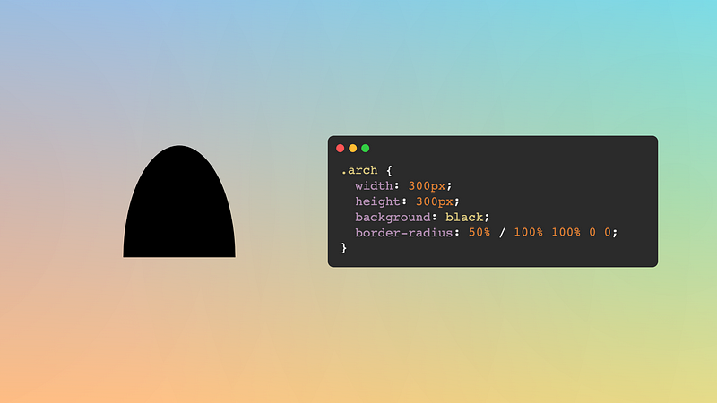
Arch
A slight variation of the ellipsis and bell, an arch is flat at the bottom and curved at the top. There's no playing with the values for this one; we can just set the border-radius property to a fixed value:
.arch {
  width: 300px;
  height: 400px;
  background: black;
  border-radius: 50% / 100% 100% 0% 0%;
}
With this approach, if the element has double width than height, we will get a semicircle instead of an arched shape.
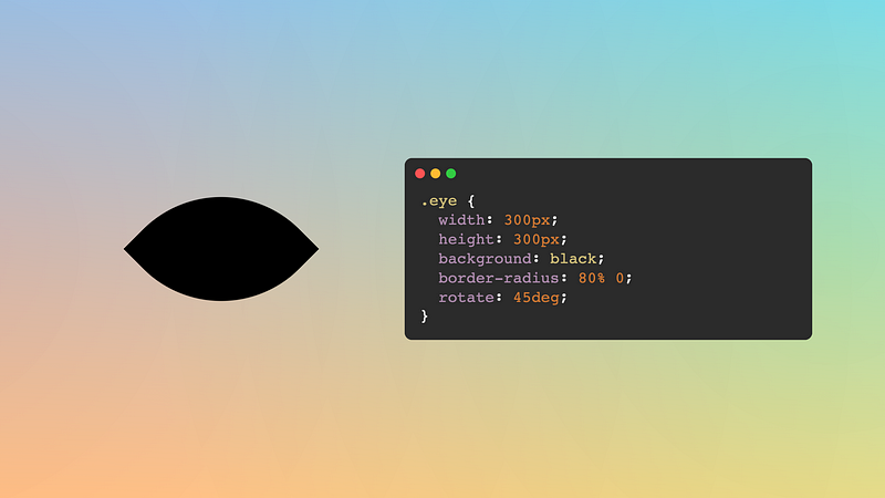
Eye
The first shape of the three that require a slight rotation. We'll start from a square and then set the border radius for two opposite corners while leaving the other two corners at zero. I always start from the top left corner and add a 45-degree rotation, but you could pick any other corner and adjust the rotation accordingly.
.eye {
  width: 300px;
  aspect-ratio: 1;
  background: black;
  rotate: 45deg;
  border-radius: 80% 0;
}
You can use the rotate: 45deg property or also transform: rotate(45deg). Either way will work. As for the border-radius, the higher the value, the softer the eye curvature will be (duplicate values to allow one side to be taller than the other: 80% 0 100% 0.)
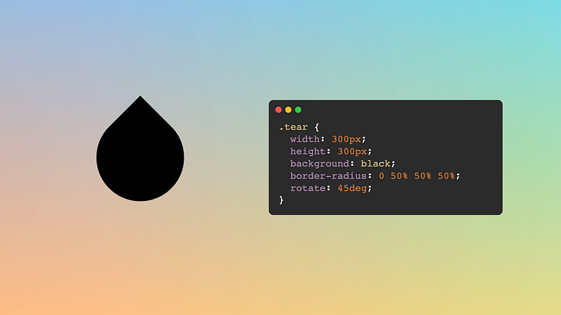
Tear
It is funny that the tear shape is a variation of the eye shape. Same code, just changing the border-radius: max out three of the radii to get a circular shape and leave the last corner radius to zero so it ends in a point.
.tear {
  width: 300px;
  aspect-ratio: 1;
  background: black;
  rotate: 45deg;
  border-radius: 0 50% 50% 50%;
}
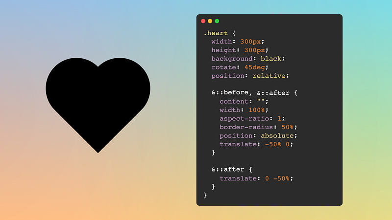
Heart
Drawing a heart is slightly different from the previous shapes, as it will use the element and both ::before and ::after pseudo-elements. We start from a square, rotate it 45 degrees, and then add the pseudo-elements as circles (see above). We translate one pseudo horizontally and the other vertically (which will look diagonally for both as the element is rotated), and it's done. The code may seem "complicated," but the idea is simple.
.heart {
  width: 300px;
  aspect-ratio: 1;
  background: black;
  rotate: 45deg;
  position: relative;
}

.heart::before,
.heart::after {
  content: "";
  position: absolute;
  width: 100%;
  aspect-ratio: 1;
  border-radius: 50%;
  background: inherit;
  translate: -50% 0;
}

.heart::after {
  translate: 0 -50%;
}
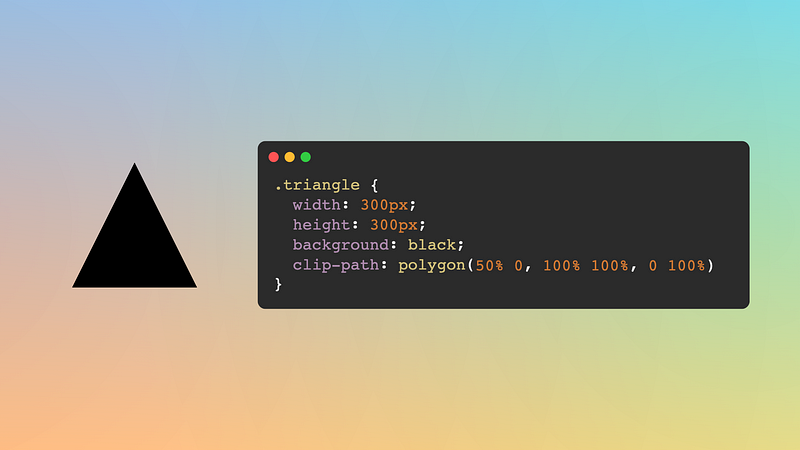
Triangle
Many online articles discuss how to draw a triangle using borders, a height/width of zero, and some transparent colors. I would highly discourage that approach. While it works, it is old-fashioned and can be a hassle if we want flexibility and responsiveness. (If you want to read more about why, I wrote an article with different methods to draw a triangle in CSS, their pros and cons).
Instead, I recommend using clip-path for drawing a triangle —and some of the following polygonal shapes. With clip-path, we specify a path (it can be using polygons, an image, an actual path, etc.) that defines a shape. Everything outside of that shape will be clipped. In the case of a triangle, we only need 3 points.
.triangle {
  width: 300px;
  height: 300px;
  background: black;
  clip-path: polygon(50% 0, 100% 100%, 0 100%);
}
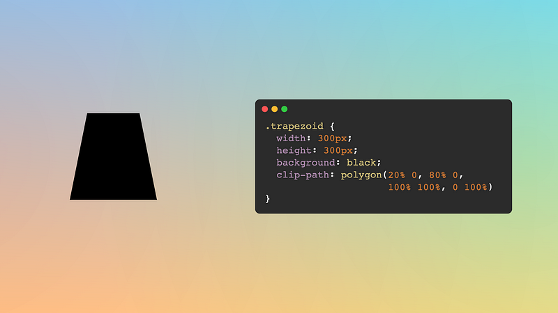
Trapezoid
Another polygon. Which are simple to make using the polygon() function in clip-path. In this case, we'll start from a rectangle or a square, and we'll need four points: the bottom ones will be in the corners, and the top will be slightly inside. And we are done!
.trapezoid {
  width: 400px;
  height: 300px;
  background: black;
  clip-path: polygon(20% 0, 80% 0, 100% 100%, 0 100%);
}
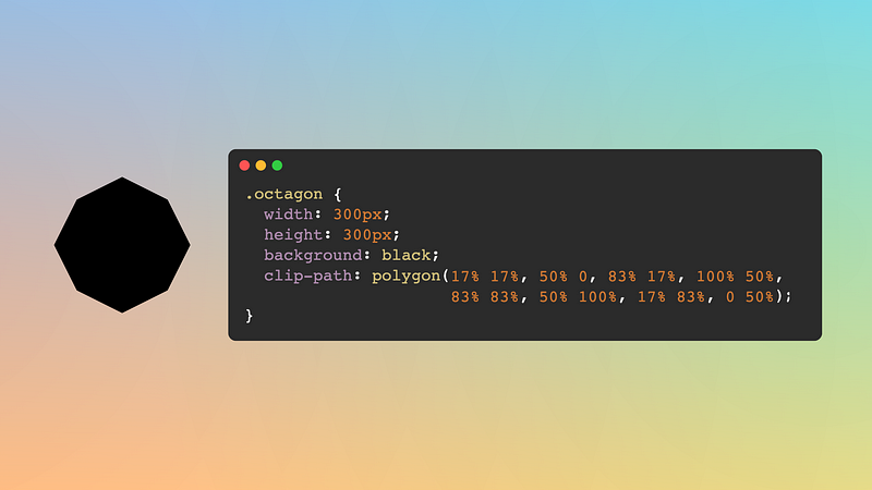
Octagon
I did the octagon because it is easy to do (no need to calculate anything or use trigonometry). The good news is that the clip-path/polygon() method can be extrapolated to any polygonal shape.
In the video, I simplified the points so they wouldn't occupy the whole screen; in reality, we need to use some decimal numbers to get an octagon:
.octagon {
  width: 300px;
  height: 300px;
  background: black;
  clip-path: polygon(16.6% 16.6%, 50% 0, 83.3% 16.6%, 100% 50%,
                     83.3% 83.3%, 50% 100%, 16.6% 83.3%, 0 50%);
}
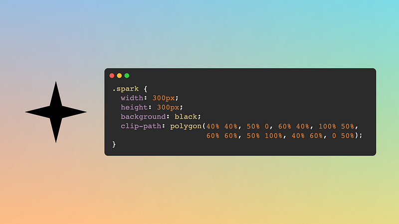
Spark
A spark is an octagon variation. The only difference is where four of the points will be located. While in the octagon, they are towards the outside; in the spark, they will be towards the inside (imagine a rotated square).
.spark {
  width: 300px;
  aspect-ratio: 1;
  background: black;
  clip-path: polygon(40% 40%, 50% 0, 60% 40%, 100% 50%,
                     60% 60%, 50% 100%, 40% 60%, 0 50%);
}
For a cooler effect, apply the shape not to the element in itself but to both ::before and ::after pseudo-elements. Then rotate one 45 degrees (it looks nicer if this rotation is applied to the ::before.)
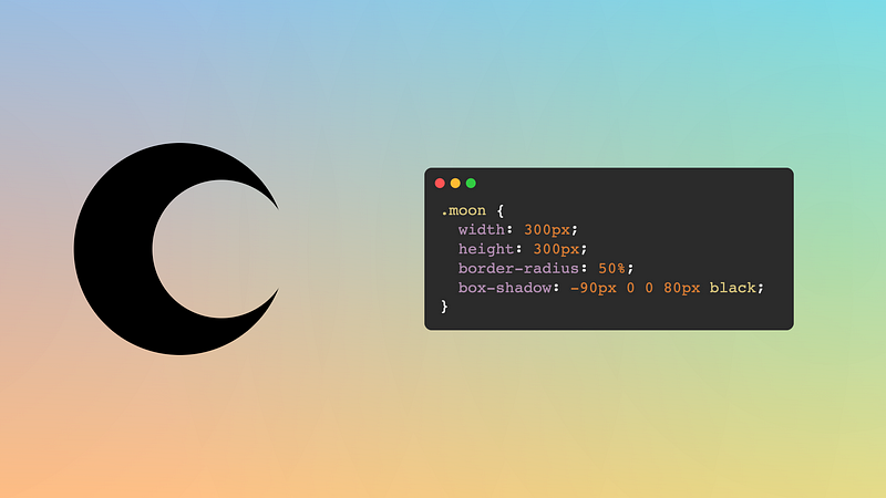
Moon
The moon can take many forms. By a moon shape, we mean a crescent (or decrescent). We can quickly achieve this by starting with the circular shape and applying a box-shadow. Box shadows allow five values: horizontal translation, vertical translation, fuzziness (optional), scale (optional), and color (optional, text color by default). Depending on whether we want a crescent or a decrescent, we'll add a big shadow to the right or left.
.moon {
  width: 300px;
  aspect-ratio: 1;
  border-radius: 50%;
  box-shadow: -90px 0 0 80px black;
}
As an alternative implementation, I recommend using masks instead of shadows. This is because with the mask implementation, the drawing of the moon is clearly defined within the flow of the page, and it matches the size of the element used to draw it (we could use inset shadows to avoid this problem). Plus, masks provide more flexibility than shadows.
.moon {
  width: 300px;
  aspect-ratio: 1;
  border-radius: 50%;
  -webkit-mask: radial-gradient(circle at 75% 50%, #0000 33%, #000 0);
}
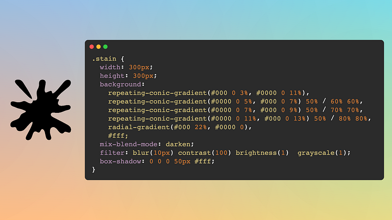
Stain/Splash
This shape is more complex than all the others on this list. I wrote a more detailed article about how to create it (including a step-by-step video). The idea is to have repeating conic gradients and apply filters to make them look smooth.
You can achieve this effect in many different shapes by changing the number of backgrounds or their sizes. Play around with it, and find the one you like the best.
.stain {
  width: 300px;
  height: 300px;
  background:
    repeating-conic-gradient(#000 0 3%, #0000 0 11%),
    repeating-conic-gradient(#0000 0 5%, #000 0 7%) 50% / 60% 60%,
    repeating-conic-gradient(#0000 0 7%, #000 0 9%) 50% / 70% 70%,
    repeating-conic-gradient(#0000 0 11%, #000 0 13%) 50% / 80% 80%,
    radial-gradient(#000 22%, #0000 0),
    #fff;
  mix-blend-mode: darken;
  filter: blur(10px) contrast(100) brightness(1)  grayscale(1);
  box-shadow: 0 0 0 50px #fff;
}
I hope you enjoyed the article and found it insightful. I'll leave the video again to close the article, just in case ;-)